DYN
TakeUForward —
Redesigning webpage
[case study]
2024 - Freelancing
Within 4 days of the redesigned takeuforward.org, the platform experienced a sudden surge of 60,000+ new users.
Year
2024
Web App
Role
UI/UX Designer
Timeline
13, Mar - 20, Mar 2024
Live View
Say Hello!
Have an opportunity, wanna collaborate
on something cool or just say hello!
Copy my Email
Get In Touch!
Get in touch!
Email - devyashnamdevinquiry@gmail.com
WP + Contact No. - +91 7470910477


How it’s started:
While discussion with client regarding the old TakeUForward website design, he expressed the need for a new, clean, and visually appealing UI that reduces the effort required to understand features and provides a seamless user experience. Additionally, He wanted to market the upcoming TUF+ feature, which was under ideation that time. He highlighted several specific problems with the existing design out of which the major problems were:
Outdated UI elements
Difficult for users to find required information
Lack of clear brand identity
Design Process
My design process includes four major categories and some subcategories in the section:
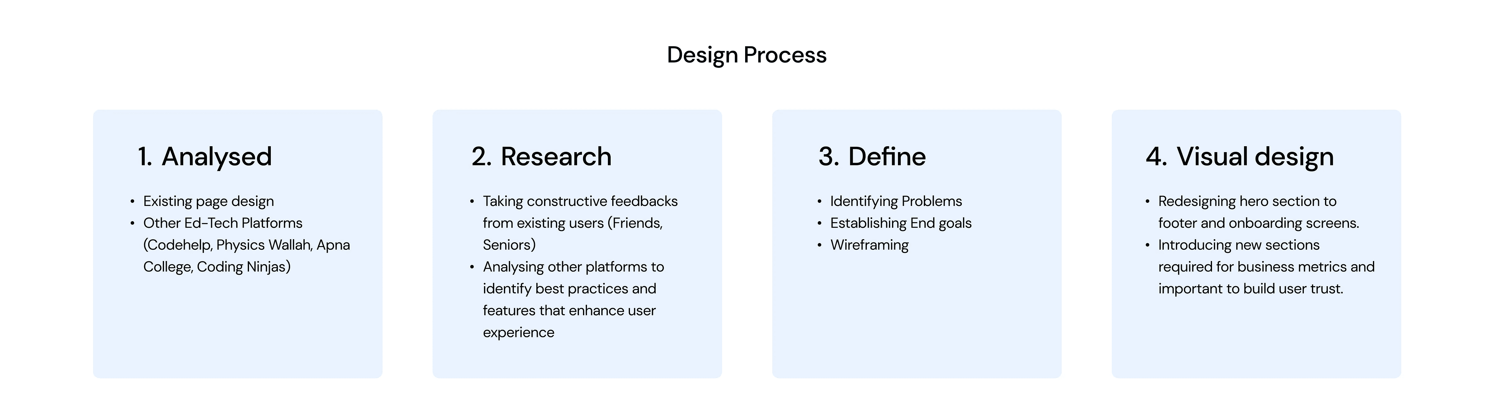
1. Analysis:
Considered visual appeal and information accessibility.
Listed potential new sections to add.
Included both direct and indirect competitors.
Focused on overall site navigation and content flow.
Defining the Problem
The existing TakeUForward.org website had several design and usability issues, including outdated UI elements, unappealing fonts, poor section hierarchy, and lack of clear communication, which hindered user engagement and understanding. Additionally, it lacked effective marketing for the upcoming TUF+ feature and important navigational aids such as social media handles and actionable CTAs. Our goal is to enhance brand identity, create a visually appealing UI, design a seamless user experience, build user trust, and promote the upcoming TUF+ (which was under development at the time).
2. Research
Explored other ed-tech websites to see how they present similar sections
Gathered feedback from friends and seniors who use TUF and other platforms
Found design inspiration on Mobbin, Pinterest, and Dribbble.
Collected insights and improvement ideas for TUF from these sources.
Competitor analysis:
Studied websites of CodeHelp, Byjus, Unacademy, and Physics Wallah
Examined their website sections and their business purpose
Identified key sections to add to TUF’s landing page
Conclusion of competitor’s analysis:
The hero section effectively communicates their offerings.
Displaying user statistics builds trust, and following these stats with CTAs encourages quick actions to connect or explore why they are popular.
Including details of happy students in testimonials adds authenticity to the positive reviews.
There should be Design consistency (smoother fonts and typography), Minimal use of colors, Engaging user onboarding.
Need to add:
TUF+ launch announcement
Real-time social media stats
Mentor introduction and achievements
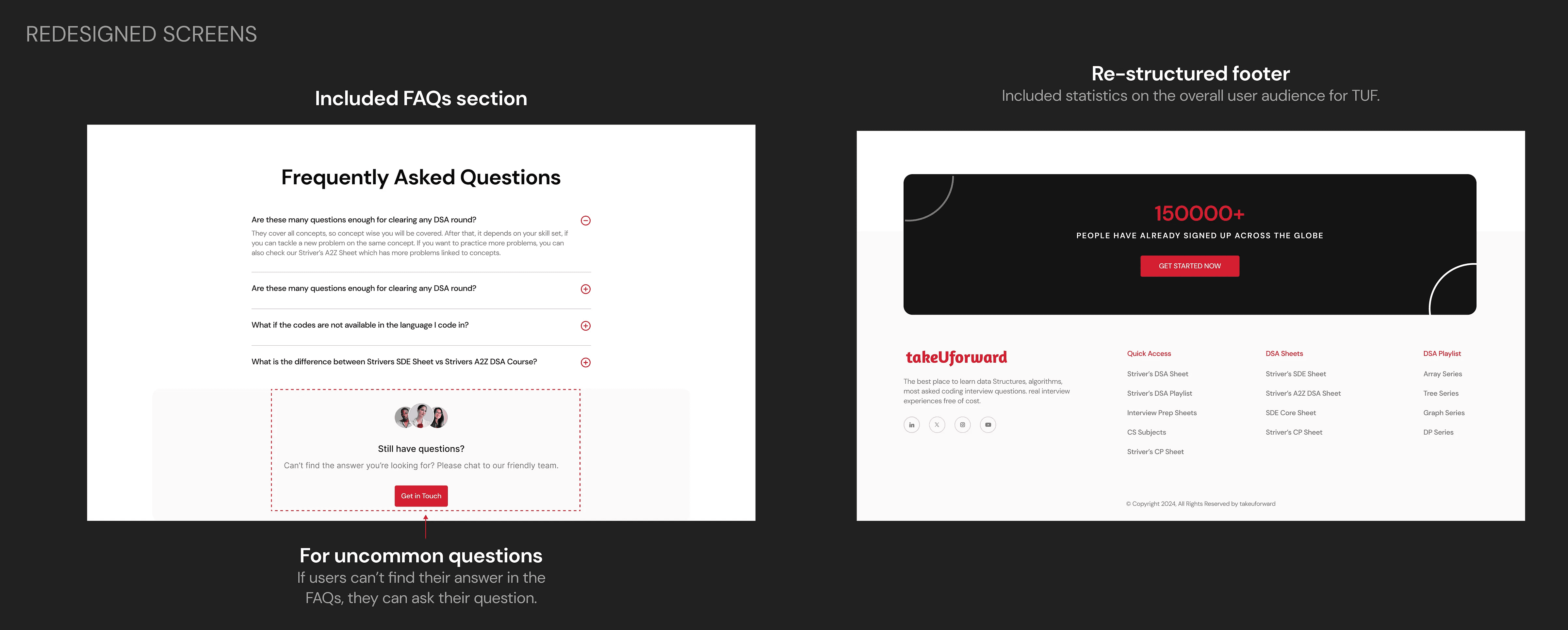
FAQs section
Footer requires restructuring and redesign
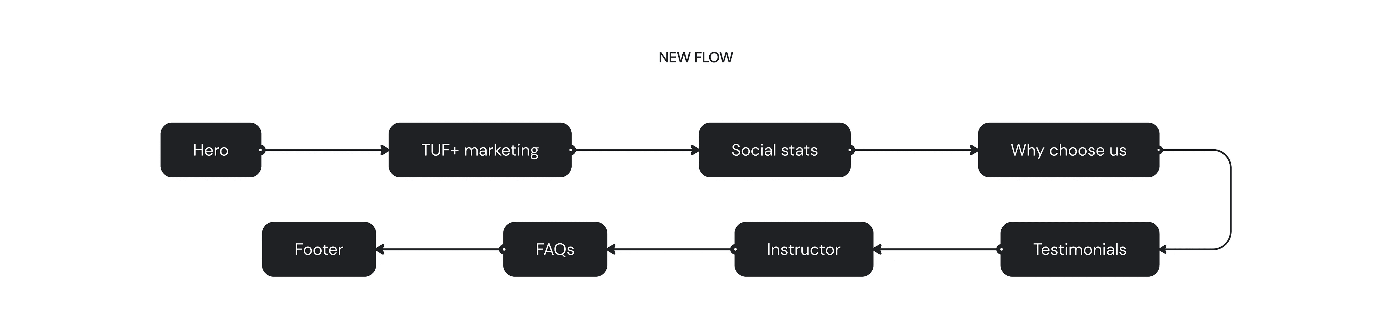
3. Define
Screen Selection: Identified key screens requiring redesign
Problem Identification: Documented existing design issues and user pain points
Goal Definition: Established clear objectives for the redesign project
Inspiration Sourcing: Noted effective design elements from competitor apps
Documentation: Compiled all insights, problems, and ideas onto reference cards
Insights Gathering: Collected and analyzed research findings

UX Breakdown
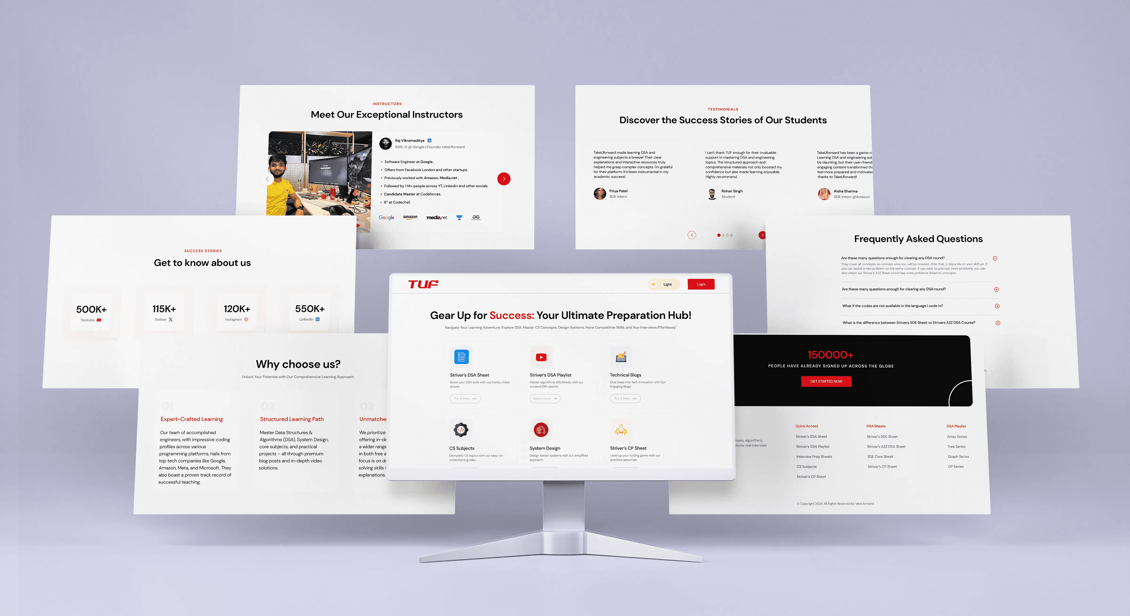
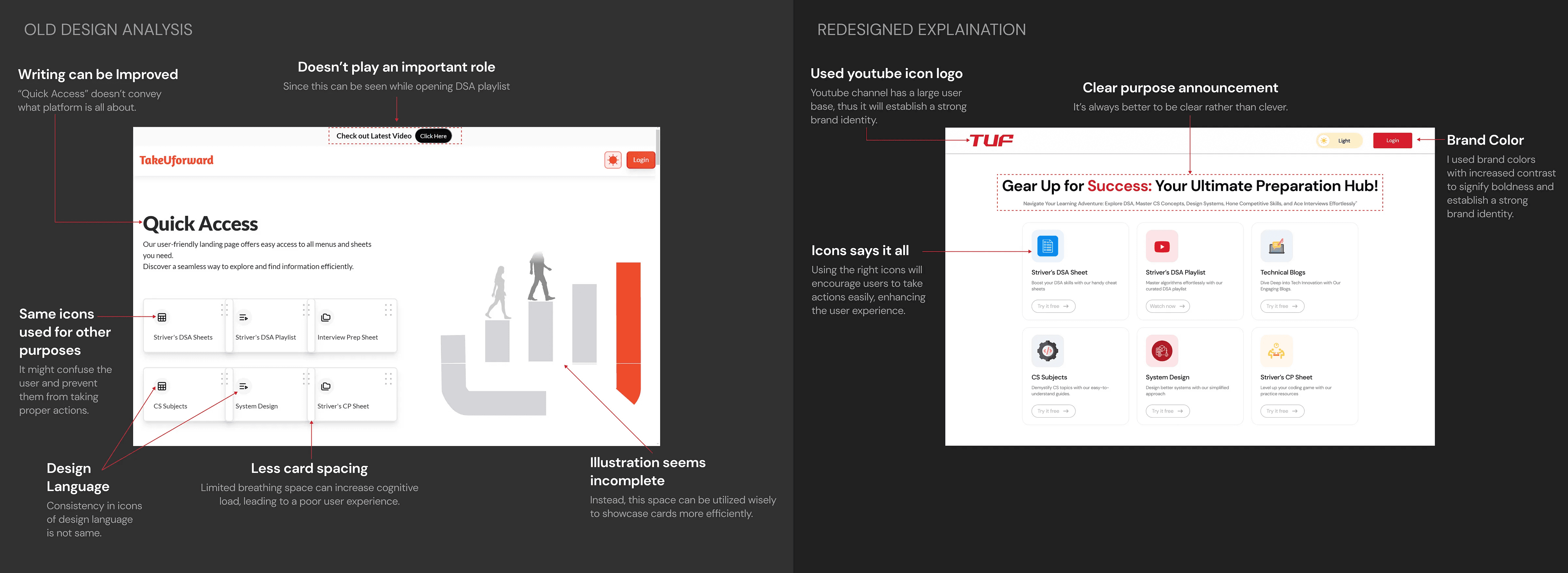
Section 1: Hero Section
The UI elements were outdated.
The fonts were not visually appealing.
The purpose of the platform was not clearly communicated.
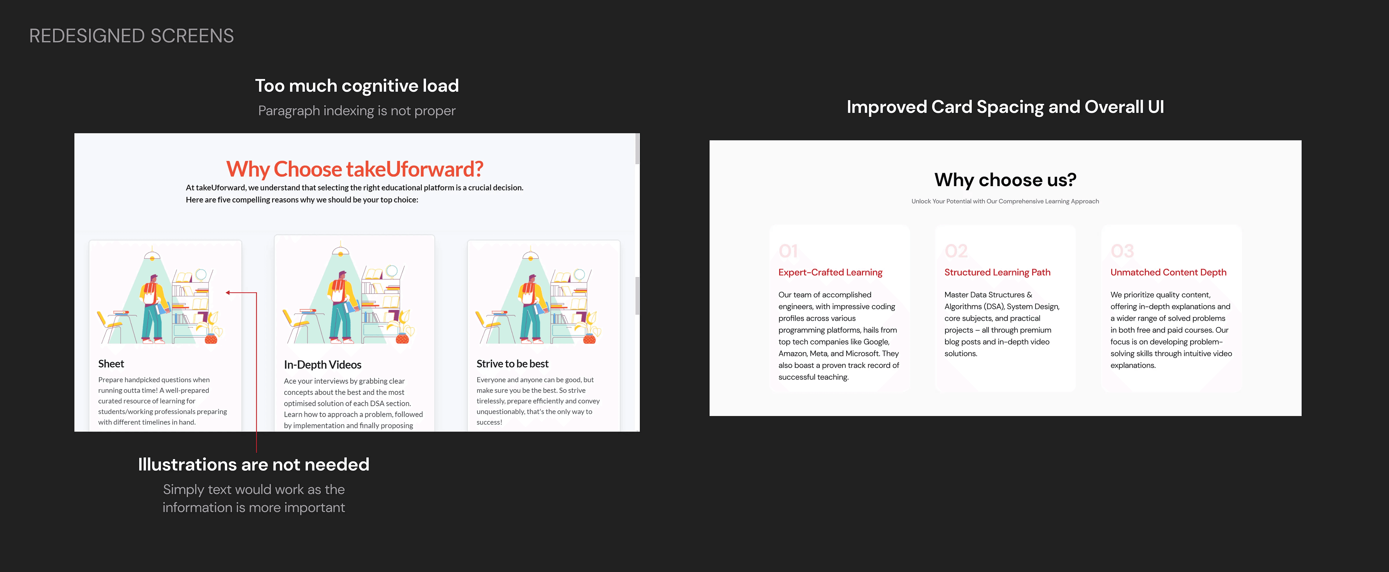
Section 2: Why Choose Us?
The section’s hierarchy was poorly designed.
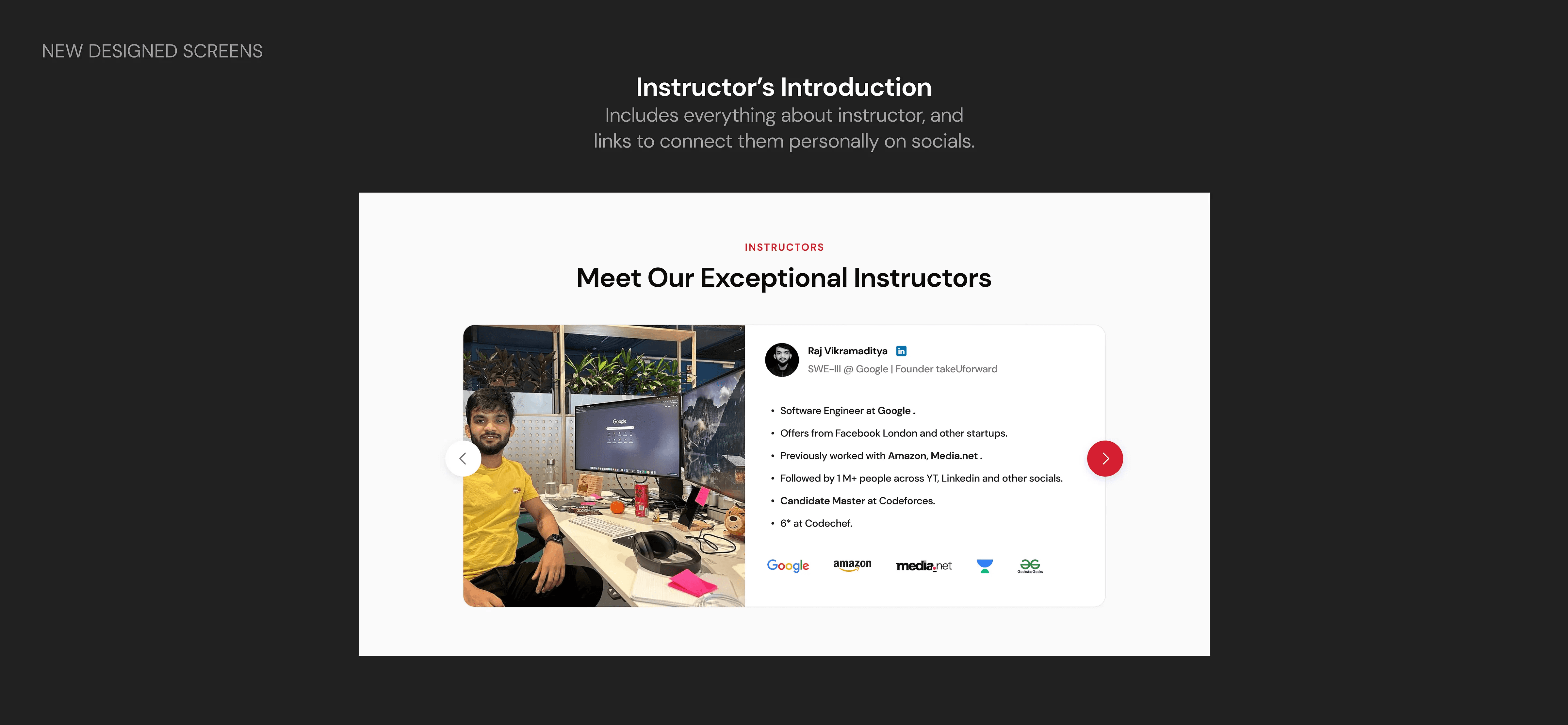
It lacked an instructor’s image and details about his career.
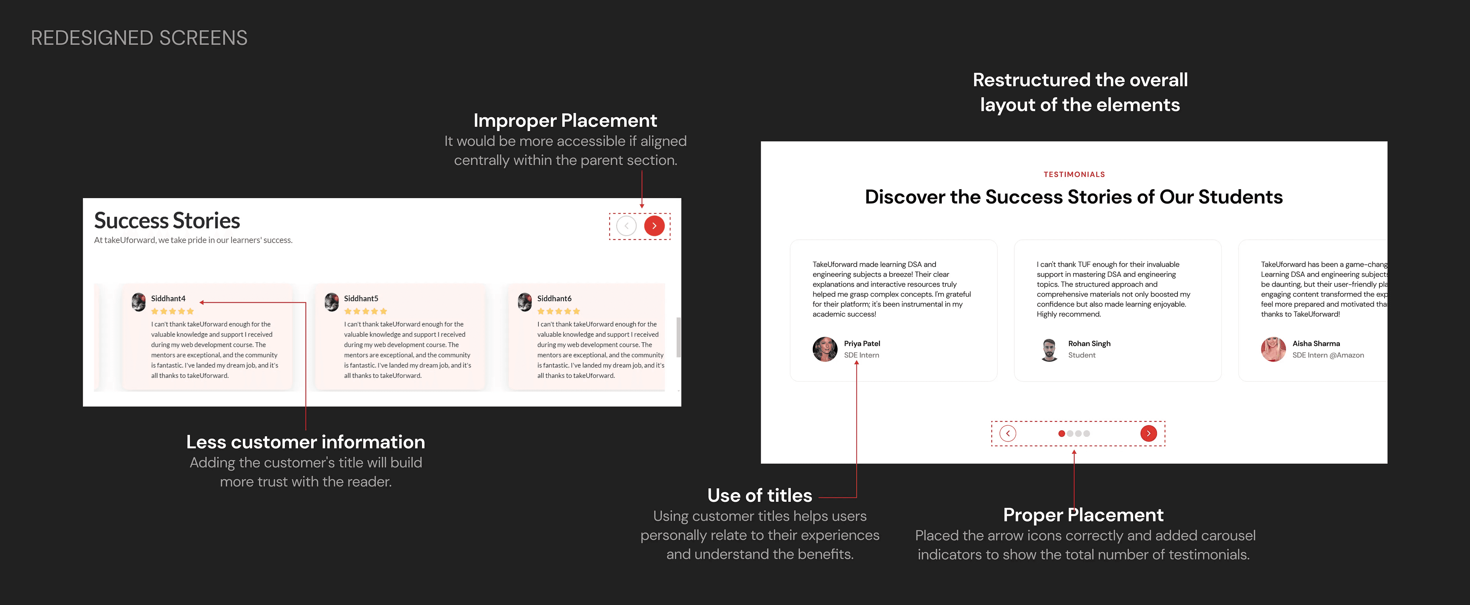
Section 3: Testimonials
The section had improper margins and poor UX writing.
Navigation arrows for testimonials were not in an easily accessible area.
Section 4: Footer
The footer lacked social media handles and actionable CTAs.
It was difficult for users to trust the platform and navigate to important content.
4. Visual Design
After establishing the objectives, I moved into the visual design phase.
Categorization & Documentation: I systematically categorized each component of the current design, identifying issues and problems within specific sections. This detailed documentation highlighted areas needing attention.
References and Iterations: Utilizing insights from other Ed-Tech websites and my documentation, I created a screen mind map and developed high-fidelity UI designs. I continuously refined elements such as the card UI, onboarding screens, social stats, and marketing call-to-actions based on usability, design principles, and business metrics.
Inclusive Design Approach: I considered edge cases to ensure seamless functionality across various scenarios. I carefully selected typography and a color theme to create a cohesive and visually appealing design that aligns with the brand identity and enhances the user experience.

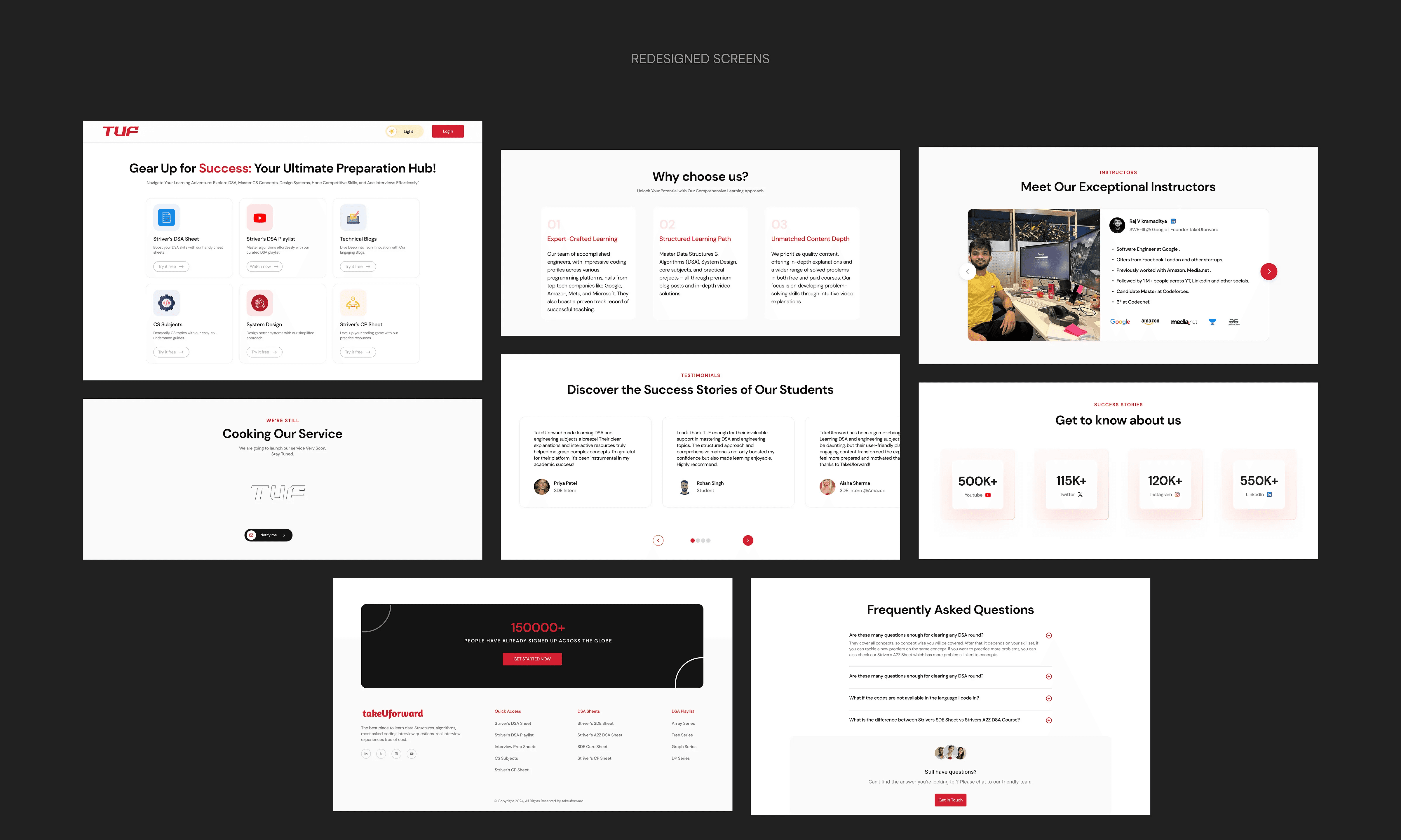
“Below, we provide an analysis of the redesigned screens compared to the older version, offering a detailed explanation of the improvements.”
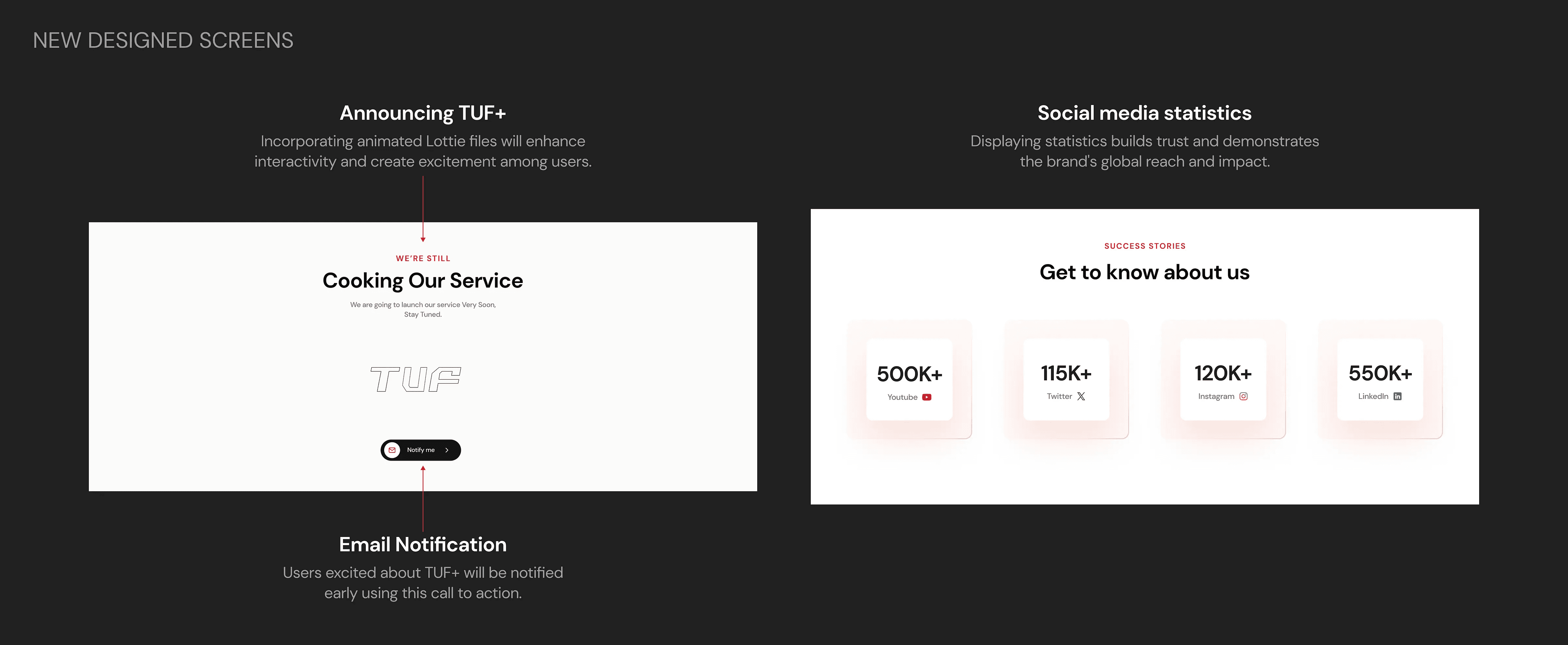
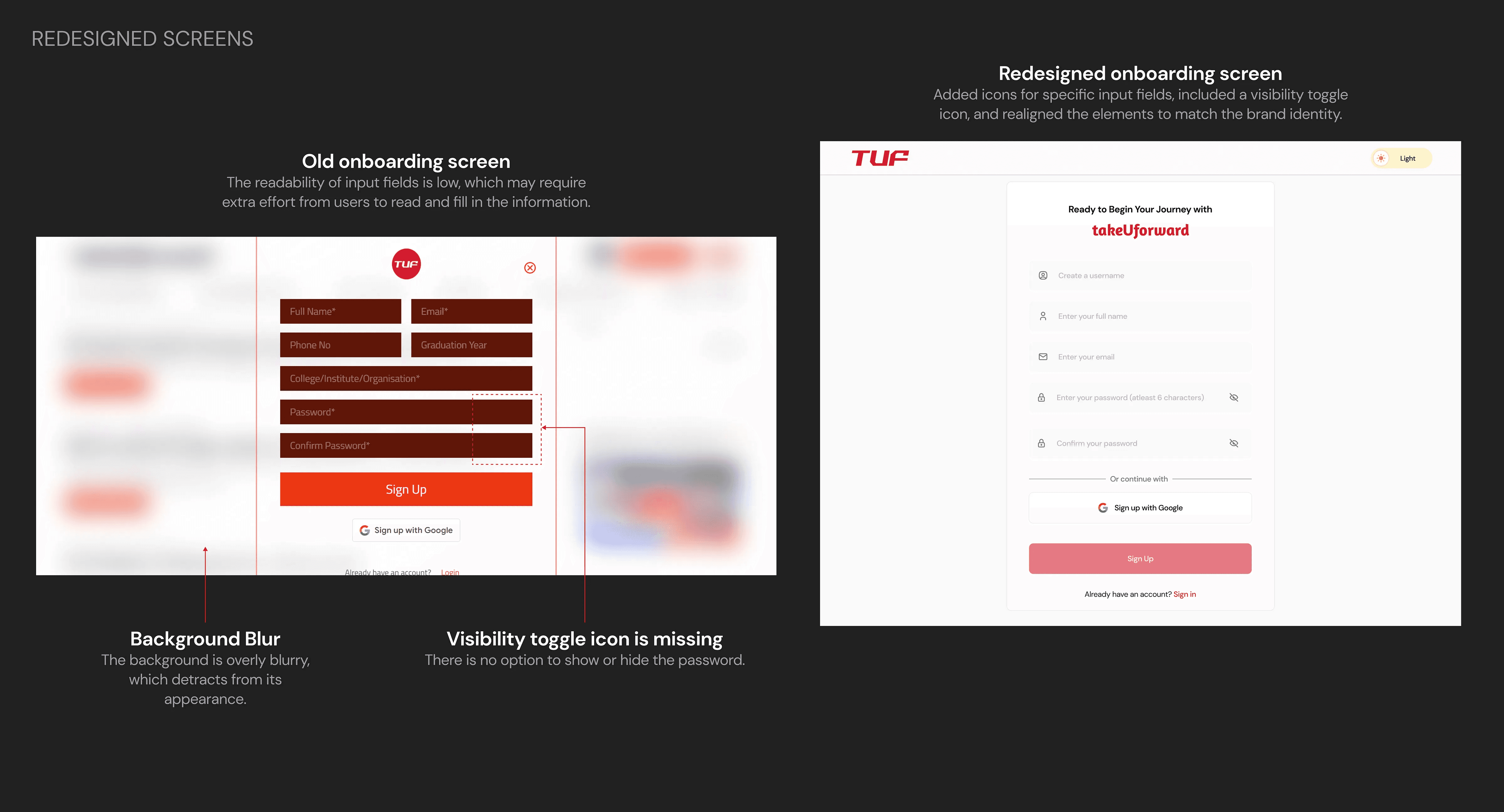
Onboarding Screens:
The onboarding screens were restructured, adding icons for specific field inputs, including a visibility toggle icon, and realigning the elements to match the brand identity. This resulted in a seamless onboarding experience, contributing to over 60,000 users getting onboarded within four days of deploying the redesigned UI.
Note: Some input fields were removed, keeping only the relevant ones after discussing with the client during the redesign.