DYN
CRED app onboarding
2023 - Freelance
I was hired as a UI/UX Designer (freelancer) to design the onboarding screens for the CRED app. My role involved creating a smooth and engaging user experience to help new users seamlessly navigate and understand the app's features. You can explore the CRED app on the Play Store or App Store through the provided links.
Year
2023
Mobile App
Role
UI Designer
Timeline
Mar 2023 - Aug 2023
Live View
Conversational UI that hooks the user
Overview
As a freelance UI/UX Designer, I was brought on to design the onboarding screens for the CRED app with the goal of creating a conversational UI that hooks the user from the start. Over the course of five months, I worked to understand CRED’s brand and user base deeply.
The project kicked off with research to identify user needs and pain points, followed by crafting wireframes and prototypes that mapped out a smooth, engaging onboarding journey. The design focused on conversational elements that made the experience feel personal and intuitive, guiding users effortlessly. After multiple rounds of usability testing and iterations, I refined the design to ensure it captured users' attention and provided clarity.
In the final stage, I handed off the polished assets to the development team and supported the implementation, ensuring the onboarding experience was both engaging and effective.
Project Details
CRED; not every one gets it. CRED is a member only playform where only individuals with more than 750 credit score can get access to the product. CRED app onboarding is a conversational user journey taking one input at a time and fetches your credit score to tell you if you are the one. If yes, it magically fetches your credit cards and bills. Make your first bill payment and get rewarded.
Challenges & Limitations
Balancing Simplicity and Information: One of the primary challenges was striking the right balance between providing enough information to guide new users and keeping the interface clean and simple. Overloading the onboarding process with too much detail risked overwhelming users, while too little information could lead to confusion.
Design Consistency: Ensuring consistency across the onboarding screens while maintaining CRED’s unique brand identity posed another challenge. It required meticulous attention to detail to align with the existing design language and user expectations.
User Engagement: Creating a conversational UI that feels natural and engaging without being intrusive was a complex task. The challenge was to make the interaction feel personal and intuitive, keeping the user hooked throughout the onboarding process.
Limited User Feedback in Early Stages: During the initial design phases, access to real user feedback was limited, which made it difficult to validate design assumptions early on. This was addressed later through usability testing, but it initially slowed down the iteration process.
Technical Constraints: Working closely with the development team revealed certain technical limitations that required adjustments to the original design. These constraints necessitated compromises to ensure the designs were feasible within the app’s architecture and resources.
Time Constraints: With a five-month timeline, managing the different phases of research, design, testing, and iteration required efficient time management. Balancing the depth of each phase while ensuring the overall project timeline was adhered to was a continuous challenge.
S1: Setup Screen
The UPI Setup Screen presented several challenges, primarily around simplifying a complex process. Setting up UPI involves multiple steps, such as entering bank details, verifying the mobile number, and setting a UPI PIN, which needed to be streamlined into an easy-to-follow flow.
Educating users unfamiliar with UPI was another key challenge, ensuring that each step was clear without overwhelming them. Additionally, maintaining security while handling sensitive information was essential, requiring a design that reassured users of their data’s safety.
Anticipating potential errors, such as incorrect bank details or failed OTP verification, and offering helpful error messages was crucial to prevent frustration.
To address these, the design incorporated progress indicators to show users how many steps remained, friendly microcopy to guide them through the process, and visual cues to highlight key actions. Clear, prominent CTAs were used to ensure smooth navigation. These considerations together created a seamless, user-friendly, and secure UPI setup experience.
S2: Card Fetching Screen
The Card Fetching Screen posed its own set of challenges, primarily focused on managing user expectations and ensuring a smooth, efficient experience while fetching card details. One of the key challenges was dealing with loading times and potential delays in fetching card data. It was important to design a screen that reassures users, keeping them engaged without causing frustration.
Another challenge was ensuring clarity in the interface, especially when displaying different types of cards or information related to the fetching process. The design had to be simple, yet informative, guiding users without overwhelming them with too much detail.
Incorporating real-time progress indicators was essential, allowing users to track the status of the card fetching process. Clear, concise microcopy was used to explain any issues or delays, helping to manage user expectations. The design also needed to handle error scenarios, such as when a card couldn’t be fetched, providing users with actionable steps to resolve the issue.
Ultimately, the screen needed to be both functional and reassuring, creating a seamless experience while fetching card data.
The Appraoch
For the Onboarding Screen Design of the CRED app, the approach was to create an intuitive, engaging, and user-friendly experience that would guide new users through the app’s features without overwhelming them. The first priority was to ensure the first impression was positive, so we focused on a clean and minimalistic design that aligned with CRED’s brand aesthetics, making the app feel approachable and easy to use.
The onboarding flow was structured to be progressive—each screen built upon the previous one, providing just enough information at each stage to keep users informed without overloading them. We used microcopy to provide helpful cues and contextual guidance, ensuring users understood what to do at every step. This included clear instructions and hints for actions, making the process feel conversational rather than transactional.
To enhance user engagement, the design incorporated visual elements such as illustrations, icons, and animations, which helped break the monotony and created a more interactive experience. We ensured that the onboarding process was short and sweet, with a focus on key actions that allowed users to get started with minimal effort.
User feedback played a key role throughout the design process. We implemented usability testing to refine the flow, ensuring the screens were both intuitive and enjoyable. Error handling was also a major consideration; for any issues or delays, we provided reassuring feedback, allowing users to proceed smoothly without frustration.
S3: Score Counting Screen
The Screen Counting Screen was designed to guide users through a step where the app needs to count or process something, such as scanning items or verifying data. The main challenge here was to ensure that the process felt smooth and transparent, without users feeling anxious about waiting or wondering about the app's progress.
The approach was to keep the user informed by integrating a real-time progress indicator that showed the status of the counting process. Whether it was a visual progress bar, loading animation, or percentage counter, it provided users with a clear understanding of how long the process would take and what was happening behind the scenes.
Additionally, reassuring microcopy was used to let users know that everything was proceeding as expected. The language was friendly and light, keeping users engaged while they waited. For longer processing times, we included subtle animations or visuals to distract from any waiting period, making the experience feel less like a chore.
The design was kept minimalistic, focusing only on what was necessary—ensuring that the counting process was the focal point without additional distractions. If any errors or issues arose, we included clear actionable feedback, helping users understand what went wrong and how they could resolve the situation quickly.
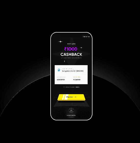
S4: Cash Back Animation
The Cashback Screen in the onboarding flow was designed to highlight the value and benefits of using CRED, specifically focusing on the cashback feature. The goal was to create an engaging, yet informative screen that clearly communicated how users could earn cashback through the app, while keeping the design simple and visually appealing.
The approach involved clear messaging to explain the cashback process in a way that felt both exciting and easy to understand. We used attention-grabbing visuals such as icons or illustrations that represented the cashback concept, alongside concise microcopy that clearly outlined how users could earn rewards. The goal was to keep it short and sweet, without overwhelming the user with too much information.
To encourage users to take action, the design included motivating CTAs that invited users to start using the app and explore cashback opportunities right away. The screen also integrated progressive onboarding by linking this cashback information with earlier steps, reinforcing the value proposition without feeling disconnected from the flow.
Additionally, trust signals like CRED’s brand logos, testimonials, or success stories could be added subtly to build credibility and make users feel more confident in using the cashback feature. The overall design was created to be visually engaging and intuitive, with clear next steps and an emphasis on the benefits of the cashback program, ensuring users understood how it worked and felt motivated to participate.
The Design Process
The design process for the onboarding screens of the CRED app was a systematic approach that involved several key stages: research, wireframing, prototyping, iteration, and final design. Below is an overview of each phase, along with the corresponding Figma screen flow screenshots that demonstrate the evolution of the design.
Research and Discovery
The process began with understanding CRED’s target audience, brand identity, and business goals. Through competitor analysis and user research, we identified pain points and user needs. This phase helped define the core objectives for the onboarding process, ensuring that the design would be both user-centric and aligned with CRED’s values.
Wireframing
In this phase, I sketched out low-fidelity wireframes to lay the foundation of the onboarding flow. These wireframes focused on structure, user journey, and interaction, without delving into visual details. The goal was to establish a clear, logical flow that guided users through the onboarding process smoothly.
Prototyping
After finalizing the wireframes, I moved on to creating high-fidelity prototypes in Figma. This step involved refining the user interface design, adding colors, typography, and branding elements. The prototypes included all key screens like the Cashback Screen, UPI Setup Screen, and Card Fetching Screen, ensuring that each screen was interactive and demonstrated the intended user flow.
User Testing and Iteration
Usability testing was conducted with real users to gather feedback on the onboarding process. Insights from this phase highlighted areas that needed improvement, such as clearer instructions or smoother transitions between screens. Based on user feedback, several iterations were made to enhance the flow, optimize usability, and fix any friction points.
Final Design and Handoff
Once the design was refined, I prepared the final screens in Figma, ensuring that all assets were optimized for development. The design was then handed off to the development team, with detailed specifications, style guides, and assets. Throughout the handoff process, I provided support to ensure the implementation was as per the design vision.

CRED is a member only playform where only individuals
with more than 750 credit score can get access
It magically fetches
your credit cards
and bills. Make your
first bill payment
and get rewarded.