DYN
Bhataka -
Modern Real Estate
Management
2024 - Freelancing
I am a UI/UX designer with one year of experience in an edtech company, now serving clients as a freelancer. I am passionate about creating intuitive and impactful digital experiences.
Year
2024
Web App
Role
UI/UX Designer
Timeline
Oct 2024 - Oct 2024
Live View
Project Overview:
Bhataka is a new concept in real estate management software, aimed at simplifying property oversight for real estate owners, including individual room/PG landlords. This project involved designing a compelling landing page with the primary goal of collecting email sign-ups from early adopters and providing a "sneak peek" of the software's innovative idea. The client for this project was an NRI (Non-Resident Indian). The live demo can be viewed at bhataka.vercel.app.
The Challenge
The core challenge was to design a landing page that not only looked modern and trustworthy but also effectively communicated Bhataka's unique value proposition to a diverse audience of property owners. The page needed to entice users to join a waitlist by showcasing key benefits like personalized user dashboards, tenant rent tracking for owners, and SMS rent payment alerts for tenants. A specific design challenge was to seamlessly integrate a subtle neon effect that worked harmoniously across both light and dark themes.
My Role & Responsibilities:
As the sole UI/UX designer on this project, I was responsible for the end-to-end design process. This included:
User Experience (UX): Competitor and design research, information architecture, and user flow considerations.
User Interface (UI): Wireframing, creating high-fidelity mockups, visual design, and developing both light and dark themes.
Tools Used: Figma (for design and prototyping), ChatGPT (for ideation and content assistance), Adobe Firefly (for AI-generated imagery/inspiration if needed), and Dribbble (for trend research and inspiration).
Say Hello!
Have an opportunity, wanna collaborate
on something cool or just say hello!
Copy my Email
Get In Touch!
Get in touch!
Email - devyashnamdevinquiry@gmail.com
WP + Contact No. - +91 7470910477


The Approach & Process:
I followed a standard design process tailored to the project's needs:
Research & Discovery:
Competitor Analysis: I researched existing real estate management tools to understand common features, identify gaps, and find opportunities for Bhataka to stand out.
Design Research: I explored current UI trends, particularly in SaaS and modern web design, to ensure Bhataka's landing page felt fresh and innovative. This included looking for inspiration for visual styles that would resonate with tech-savvy property owners.
Ideation & Strategy:
Layout & Information Architecture: The primary goal was simplicity. I structured the page logically, starting with a strong hero statement, followed by a glimpse of the product, a breakdown of its core benefits ("How it Works"), and a clear call to action. The flow was designed to guide the user naturally towards the email sign-up.
Content Prioritization: Key features like "personalized user dashboard," "tenant rent tracking," and "SMS alerts" were identified as primary selling points to be highlighted.
Design & Prototyping (Figma):
Wireframing: Basic layouts were sketched to define the structure and placement of elements before moving into visual design.
Visual Design - Modern & Engaging:
Color Palette: A modern palette was chosen, with a vibrant purple as the primary accent color to convey innovation and energy. This was carefully balanced with neutrals for readability.
Typography: Clean, sans-serif fonts were selected for a contemporary feel and optimal legibility across devices.
Imagery: Isometric illustrations of property and mockups of the software dashboard were designed to give a tangible preview of the product.
Light & Dark Themes:
Strategy: The core strategy was to maintain brand consistency while optimizing for user preference and readability in different lighting conditions. The dark theme focused on high contrast to make elements pop, while the light theme aimed for an airy, clean aesthetic.
Neon Effect: The challenge of incorporating a neon effect was approached by using it sparingly as an accent, ensuring it enhanced the design without overwhelming it or causing readability issues. For the light mode, this meant a more subdued glow, while in dark mode, it could be slightly more pronounced.
Call to Action (CTA): The "Join Now" button was designed to be clear and prominent, using contrasting colors and strategic placement to draw the user's attention.
Design Solutions & Decisions:
The landing page was structured into key sections to tell a compelling story:
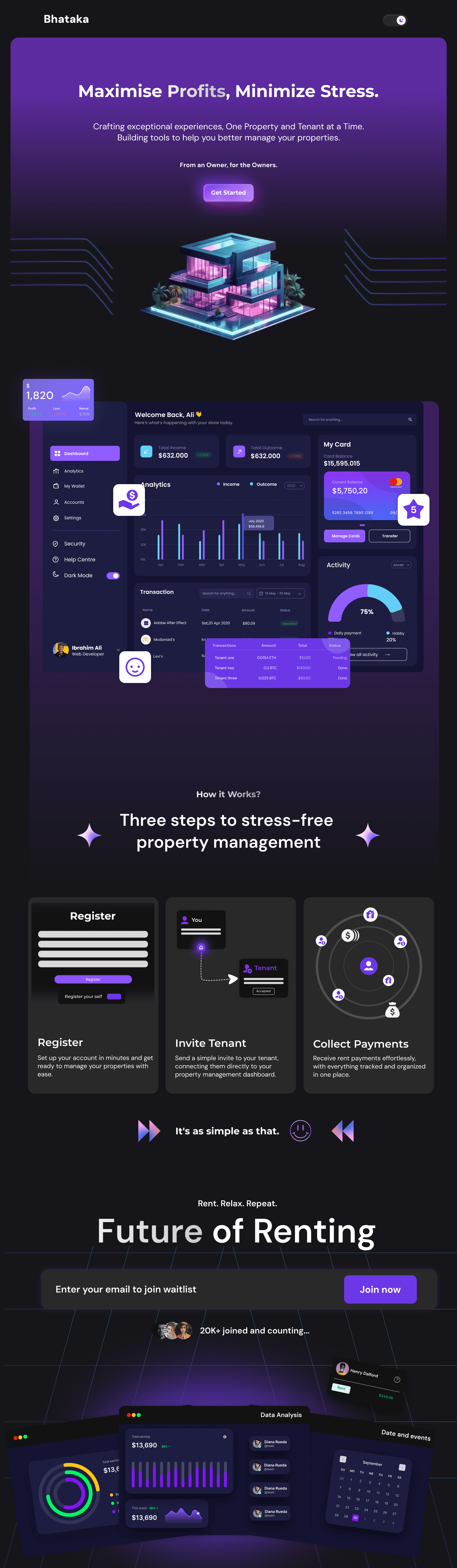
Hero Section: A strong, benefit-driven headline, "Maximise Profits, Minimize Stress," immediately addresses the user's pain points. It's paired with a visually appealing isometric illustration of a modern property and a primary "Get Started" (or similar) CTA.
Product Sneak Peek: A mock-up of the Bhataka dashboard is prominently displayed, giving users a tangible glimpse of the software's interface and features. This section aims to build credibility and excitement.
"How it Works" / Value Proposition: A simplified three-step process ("Register," "Invite Tenant," "Collect Payments") breaks down the ease of using Bhataka, making the concept accessible and appealing.
"Future of Renting": This section reinforces the forward-thinking nature of the software.
Email Collection Form: A clear and concise form with a "Join Now" CTA is strategically placed to capture leads.
Dual Themes (Light & Dark):
Light Mode: Offers a clean, bright, and professional look, with dark text on a light background for easy readability in well-lit environments.
Dark Mode: Provides a sleek, modern, and focused experience, reducing eye strain in low-light conditions. The vibrant purple accents and neon effects stand out effectively against the dark backdrop. Consistent iconography and layout ensure a seamless transition between themes.

Biggest Challenge & Solution:
The most significant design challenge was implementing the neon effect tastefully across both light and dark modes.
Challenge Details: Neon effects can easily look overpowering or reduce legibility if not handled carefully, especially in a light theme. Ensuring the effect felt modern and sleek, rather than dated or distracting, was crucial.
Solution: I opted for subtle neon glows on key interactive elements or highlights. In the light theme, the intensity and spread of the glow were minimized, often using a desaturated version of the accent color. In dark mode, the neon effect could be slightly more vibrant to create a striking contrast while still maintaining overall visual harmony and readability. Extensive testing in Figma helped refine the right balance for both themes.
Outcomes & Achievements:
Client Satisfaction: The client was highly satisfied with the final designs, providing positive feedback and requiring zero revisions. This attests to a clear understanding of the project requirements and effective execution.
Design Quality: The project resulted in a "sleek modern design" that aligns with current digital product aesthetics and effectively showcases the innovative nature of Bhataka.
Successful Theme Implementation: Both light and dark themes were developed to a high standard, offering visual appeal and usability.
Demo Launch: The designed landing page is live in a demo environment (bhataka.vercel.app), ready for initial user interaction and email collection.
User Reaction: As the project is in its early stages for email collection, quantitative user reaction data is not yet available.
Key Learning:
This project reinforced the power of agile problem-solving within the design process, especially when working as a solo freelancer. Successfully translating the client's innovative concept and addressing specific aesthetic challenges like the dual-theme neon effect with zero revisions highlighted the value of clear initial communication, iterative design explorations in Figma, and leveraging inspirational resources like Dribbble. It also underscored the efficiency gained by focusing on a simple, clear layout to communicate a new product idea effectively.